SYRACUSE STAGE:
Over the past 15 years I have worked as an in-house design agency for Syracuse Stage. My responsibilities have included building and designing Stage’s website, season branding, and all forms supporting communications such as print and digital advertising + publications, signage and wayfinding, photography+ videography and more.
23/24 SEASON BRANDING
PROCESS
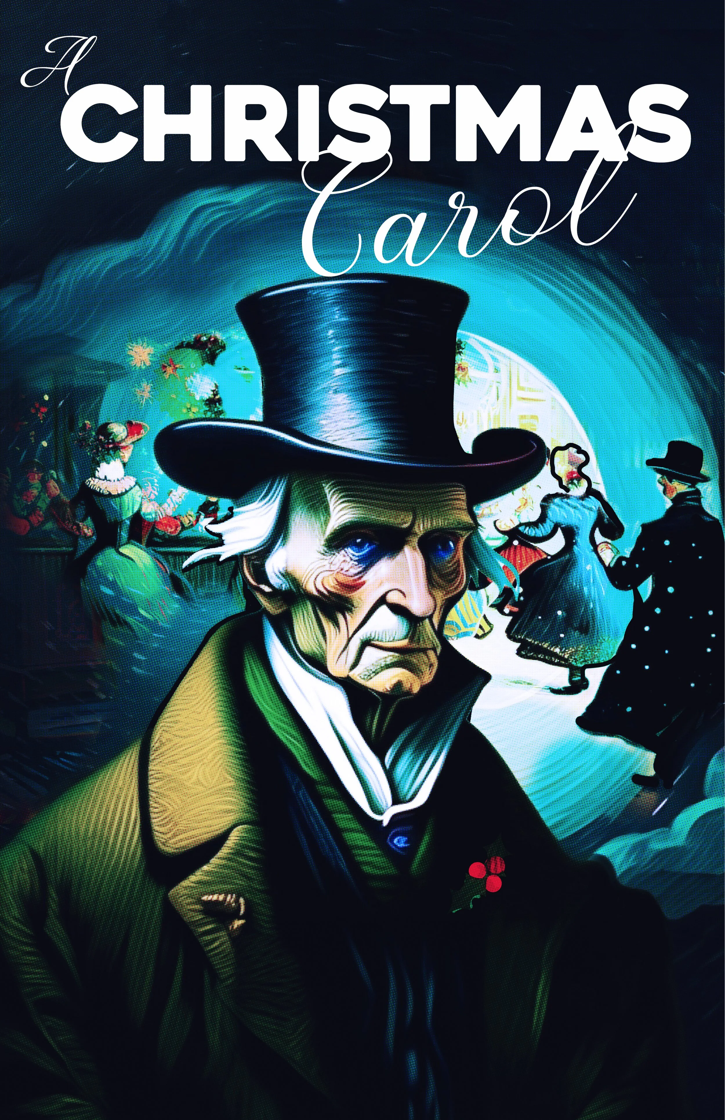
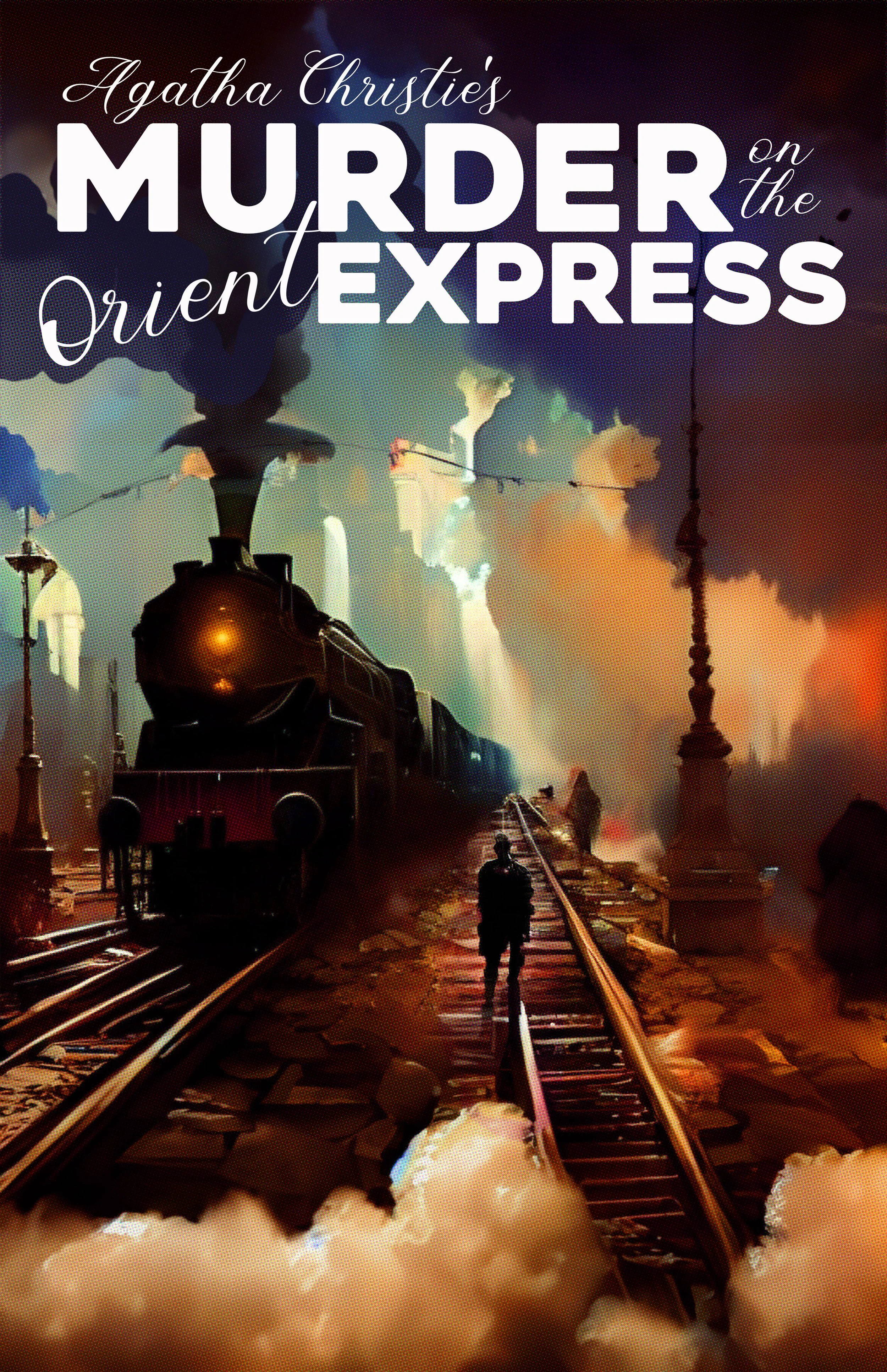
The season posters were developed this year with Stage’s 50th anniversary in mind. I wanted the posters to have one main “character” as well as bold, rich, saturated colors. “Syracuse Stage tells stories that engage, entertain, and inspire us to see life beyond our own experience.”
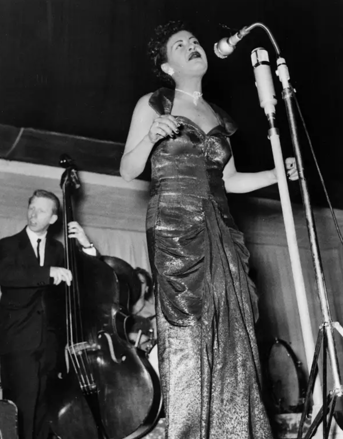
In “Lady Day” Billie Holiday is performing in a run-down bar, during one of her last performances before her death in July 1959. Through the play her joy and victory through performing music (even while battling substance abuse) is what I chose to illustrate influenced by this quote from a reviewer who watched her perform at Carnegie hall in 1956:
“…I will not forget the metamorphosis that night. The lights went down… Miss Holiday stepped from between the curtains, into the white spotlight awaiting her…with gardenias in her black hair. She was erect and beautiful; poised and smiling. And when the first section of narration was ended, she sang – with strength undiminished – with all of the art that was hers. I was very much moved. I recall only one thing. I smiled."
With it’s 50th anniversary Stage is both looking to celebrate a nostalgic look back while also embracing the future ahead. The posters have a similar visual representation, both nostalgic and familiar with a timeless feel.
50th Lobby Mural
A lobby mural celebrating milestone productions through Stage’s 50 year history.
50th Digital Exhibition
A minisite dedicated to exploring Stage’s history, accomplishments and hopes for the future will evolve over the 23-24 season.
50th ANNIVERSARY BRANDING
For Syracuse Stage’s 50th Anniversary, in addition to my usual campaign work on the season’s programming I also worked to build a digital exhibit that celebrates a look back as well as hopes for Stage’s future. The 50th digital exhibit also was an opportunity for us to work with a local agency for some deliverables. I created a quick 50th brand guideline here.
The brand guideline contained a new version of the existing logo in order to include the 50th and also sets examples of best uses of stage’s primary typefaces as well as season display fonts.


